
Sometimes a scene requires a bit more extra media or information. E.g. an audio clip giving instructions to the student, an in-scene video that a student can optionally watch first, or several in-scene text boxes next to objects of interest. This is where scene elements become very helpful. Scene elements are extra elements that can be added to a node. In the app they appear as small round icons with either a default icon or (if set) a custom icon. They are clickable in the app, so depending on the type of the scene element either a text box will show, audio will play or a video frame will show.
Adding a text scene element
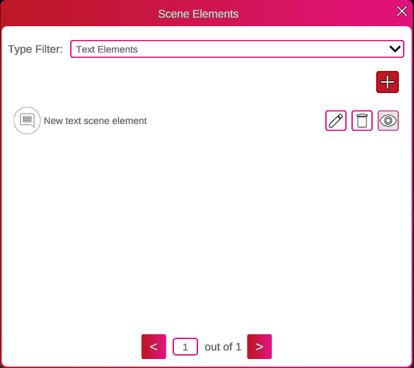
Scene elements can be added to either a 360 Image or Scenario Question node. After clicking on the ‘Scene Elements’ button, a window shows where scene elements can be added to the node. In the type filter we have to select what type of scene element we want to add. In this case a Text Scene Element. Then we press on the plus button and a new text scene element is added with default data.
With the edit button (pencil) we open another window in which we can change the element name, which is the internal name (so in the node graph) for the scene element. We can provide a title and a body text in the content box. With text color we can change the color of the text. With the plus button next to it, we can store preset colors, in case they are used often. The panel color can be set too, with an additional A value, which is the alpha/transparency. 265 is fully opaque and 0 is invisible.
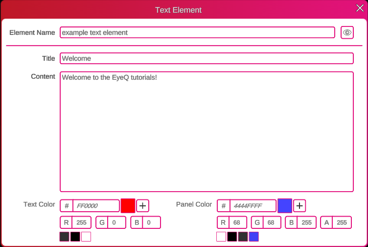
If you’re not familiar with hex or RGB values for colors, Google has a built-in color picker here. https://www.google.com/search?q=hex+color+picker
Added elements can be deleted with the recycle bin button or previewed with the eye icon. Multiple scene elements can be added to a node and also of mixed type.
Positioning the scene element
After the scene element is added in the node, it still has to be positioned in the scene as well. For this, press ‘Edit Scene’ to see the Scene View and find the scene element in the overview panel on the right. Press the plus button to add it to the scene and then click and drag it into position.
Text scene element properties
Several properties can be set how the scene element will behave in the app.
| Hidden | The element icon is initially invisible |
| Autoshow | The text panel will automatically show at the start of the scene |
Note: when hidden is combined with autoshow, the autoshow will trigger the text scene element and therefore its icon is no longer hidden.
Setting a custom icon
Scene elements have a default icon representing their type, but this icon can be replaced with a custom icon. Click on the small edit button that appears when you hover over the scene element icon. Now a custom icon can be selected from the element icons uploaded via the side bar. They can also be reverted to the default icon by hovering over the icon and pressing the recycle bin button.
